Setting the Scene
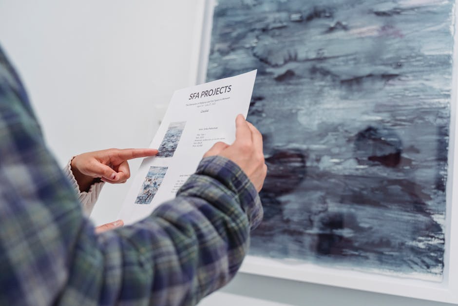
There’s no shortage of group shows in 2026 but few come out swinging with the emotional punch of “Chromatic Pulse,” the flagship spring exhibition at New Amsterdam Modern. Located in the heart of the city’s revitalized South Wharf district, the gallery doubles down on a potent concept: turning color into language, and emotion into form.
Curated by Ava Moreno, a rising force known for her instinctive, less is more approach, the exhibit brings together 14 contemporary artists who use color as a central tool for emotional communication. From Zainab Okoro’s bleeding reds and brush heavy abstractions to Luca DeLuca’s meditative pale monochromes, the show spans grief, exaltation, rage, and release without resorting to emotional cliché.
The show’s thematic scope is tight and unapologetic: not just art that features color, but art that relies on it emotionally. No detours. Each piece was chosen with the curator’s eye for reaction, not decoration. The result is a sequence that feels less like a gallery stroll and more like a slow, wordless scream or whisper depending on where you stand. It’s that kind of specificity that earned this show an early spot on critics’ radar, and why it’s anchoring the season’s conversation around feeling, composition, and the raw weight of visual impact.
The Color Language of Emotion
Color doesn’t just decorate these canvases it speaks. In this exhibition, artists aren’t using red because it’s bold or blue because it’s pretty. They’re deploying color tactically, dialing emotional frequencies directly into the viewer’s nervous system. A deep, blood warm crimson throws tension into the room. A desaturated teal holds a quiet, suspended grief. Bright yellows shatter gloom like a punch of optimism. These aren’t palettes they’re emotional architectures.
Technique matters. Many pieces in the show use layering with intention slow glazing multiple translucent tones to build complexity and mood, while others embrace heavy, saturated strokes that hit like emotional gut punches. Abstraction reigns here not to be cryptic, but as a tool. When forms melt or blur, the emotion has room to breathe, unboxed by realism.
One standout: “Echo Refracted” by Leila Arjan. It’s a large canvas flooded with a fractured cascade of burnt ochres, smoke blue, and acid green. There’s no figure, but the tension sits heavy it’s grief colliding with memory, unspoken but precisely felt. Another, “Threshold” by Mateo Ruiz, builds slow burning hope through dense layering: transparent whites over violent pinks, gradually calming into warm gray. The visual journey maps an emotional one.
Across the board, color choices here aren’t aesthetic accessories. They are what the whole exhibition hangs on. Each stroke carries weight. Each hue a feeling, sharpened or softened by how it’s placed. Emotion is not implied it’s delivered.
Diverse Perspectives, Shared Humanity
Culture as a Lens for Emotion
One of the exhibition’s most powerful threads is how artists of diverse cultural backgrounds channel emotion through color. Rather than a monolithic approach to emotional expression, the exhibit reveals a tapestry of perspectives. From indigenous symbolism to postcolonial narratives, the cultural context behind each artwork adds richness to the emotional stories on display.
A West African artist infuses golds and vermilions to signify resilience and communal joy rooted in ancestral traditions.
A Japanese painter uses muted blues and grays, drawn from sumi e influences, to explore solitude and inner stillness.
A queer Latinx collective reconfigures neon palettes as a reclaiming of identity and pride through joy and resistance.
Each work offers not only a gesture of personal expression but also a glimpse into how emotion is shaped, translated, and reinterpreted through tradition, diaspora, and lived experience.
Empathy in Visual Form
Several pieces throughout the show stand out for their ability to evoke empathy at first glance. Unlike concept heavy works that require extensive context, these pieces lead with emotional immediacy, using the language of color, body, and space to speak directly to the viewer’s senses.
One installation features a fragmented mirror surrounded by warm hues of tangerine and rust inviting viewers to see parts of themselves framed in color.
Another piece, a large scale abstraction in layered acrylic, pulses with tension its jagged reds and blurred mauves mapping the interior of heartbreak.
In each instance, artists succeed not only in expressing their inner worlds, but in opening space for others to feel seen within them.
Emotional Dualities in Dialogue
A key curatorial strength of the exhibit is its deliberate pairing of emotional opposites. This creates a dynamic viewing experience that avoids sentimentality in favor of tension and resolution.
Joy vs. Grief: One gallery juxtaposes a luminous canvas of yellow arcs radiating childhood memory next to a grayscale portrait painted with streaks that mimic weeping.
Rage vs. Healing: Another section contrasts bold, aggressive brushwork in acidic greens with soft fabric installations designed for touch, evoking care and recovery.
By placing these polarities side by side, the show underscores a vital point: emotions are often intertwined, not isolated. The result is an exhibition that challenges viewers to hold complexity to feel more than one thing at once.
Material, Form, and Composition
This exhibition doesn’t stop at canvas. Artists push well past tradition, experimenting with acrylic on plexiglass, stitched silk panels, found objects, and digital overlays. There’s an immediacy to this mixed media approach it grabs the viewer physically and doesn’t let go. One installation combines shattered mirrors with oil paint, forcing the audience to confront their own reflection in a distorted emotional landscape. It’s raw, and it works.
Composition is not accidental here. Placement, imbalance, repetition these decisions expand the emotional palette without saying a word. Large scale works overwhelm in a way that mimics anxiety. Sparse pieces allow space for grief to stretch out. You don’t just view these works, you inhabit them.
Artist Sofia Lenz, whose burnt textile tower anchors the back gallery, explains: “I wanted the piece to feel like breath right after panic. Ugly, necessary, but also transformative.” Another contributor, Naeem Raji, incorporates kinetic elements into a series on joy and disruption. “Emotion moves,” he notes. “So the art needed to move, too. Stillness felt dishonest.”
This is work that explores emotion not just through content, but through craft, weight, and presence. The medium is no longer the base. It’s part of the message.
Curatorial Strengths
Engaging Viewers Through Layout
The flow of an exhibition can profoundly shape how audiences connect with the work and this 2026 showcase makes strong curatorial choices that elevate emotional engagement. Rather than isolating pieces by artist or medium, the layout groups works by emotional tone, encouraging viewers to move through curated zones of feeling.
Thematic progression from softer, introspective pieces to more intense, cathartic works
Open sightlines that allow visual echoes between artworks across the gallery
Movement is directed but not rigid, giving visitors both guidance and freedom
Lighting and Spatial Choices To Amplify Emotion
Lighting design plays a crucial role in how color and by extension, emotion is perceived. In this exhibition, light is used dynamically to draw attention, soften transitions, or heighten drama.
Warm lighting for works rooted in nostalgia and comfort
Spotlight isolation for pieces focused on loss or solitude
Strategic shadows to introduce ambiguity or introspection
The use of negative space between high saturation works gives the eye and emotions time to rest, reinforcing the overall rhythm of the exhibition.
The Art of Editorial Curation
Beyond what’s visible on the walls, thoughtful editing defines the emotional arc of the show. Pieces were carefully selected not just on merit, but for how they interact with one another.
Clear narrative structure: emotional highs and lows spaced with intention
Certain bold or overly literal works excluded in favor of nuance
Emphasis on ambiguity and open interpretations, prompting sustained reflection
The result: a show that feels cohesive without being uniform one that respects subjectivity while guiding viewers toward shared emotional ground.
Where This Exhibition Stands Among Spring’s Best
In a season crowded with retrospectives and overly safe group shows, this exhibition doesn’t just hold its own it pushes forward. While other galleries are still leaning on big names or curating by era, this one took a bolder route: using color as the spine of an emotional, cross cultural dialogue. Few other shows dared to hang pieces purely on emotional resonance rather than historical context or technical lineage. It’s a risk and it works.
Compared to more conventional seasonal favorites, this exhibition feels less like an overview and more like a confrontation. The curators weren’t afraid to pair works that clash emotionally or thematically, forcing the viewer into active reflection. There’s tension built into the layout. There’s room for silence as much as saturation.
Not every gamble lands perfectly, but the ones that do hit deeply. And that’s more than can be said for many safer shows this spring that blur into one another. For a full look at what else is worth your attention this season, check out Top 5 Must See Art Exhibitions Opening This Spring.
Final Take
This exhibition isn’t built for casual drop ins or tourists killing time. It’s for art lovers who want to feel something. For emotional thinkers who find language too narrow a tool. For anyone who sees color not just as hue, but as presence capable of carrying the weight of memory, joy, longing, or unrest.
The lasting power of the show isn’t in shock or spectacle. It’s in the slow burn effect the way certain color fields or textures stick in your mind when you’re back home, washing dishes or walking to work. Some works haunt. Others soothe. All of them demand time, and give something back if you actually look.
For those wanting to go deeper, dive into essays by curator Mina Halstrom on chromatic affect theory, or re read Josef Albers’ classic “Interaction of Color” through the lens of feeling instead of form. Companion events include the artist panel at RAVEN Gallery next month and the interactive color sound installation opening soon at Central Pavilion. Use this show as a springboard it will meet you halfway.
 Ask Gabrielo Bradfordsicker how they got into artist spotlights and interviews and you'll probably get a longer answer than you expected. The short version: Gabrielo started doing it, got genuinely hooked, and at some point realized they had accumulated enough hard-won knowledge that it would be a waste not to share it. So they started writing.
What makes Gabrielo worth reading is that they skips the obvious stuff. Nobody needs another surface-level take on Artist Spotlights and Interviews, Exhibition Announcements and Reviews, Art Gallery News. What readers actually want is the nuance — the part that only becomes clear after you've made a few mistakes and figured out why. That's the territory Gabrielo operates in. The writing is direct, occasionally blunt, and always built around what's actually true rather than what sounds good in an article. They has little patience for filler, which means they's pieces tend to be denser with real information than the average post on the same subject.
Gabrielo doesn't write to impress anyone. They writes because they has things to say that they genuinely thinks people should hear. That motivation — basic as it sounds — produces something noticeably different from content written for clicks or word count. Readers pick up on it. The comments on Gabrielo's work tend to reflect that.
Ask Gabrielo Bradfordsicker how they got into artist spotlights and interviews and you'll probably get a longer answer than you expected. The short version: Gabrielo started doing it, got genuinely hooked, and at some point realized they had accumulated enough hard-won knowledge that it would be a waste not to share it. So they started writing.
What makes Gabrielo worth reading is that they skips the obvious stuff. Nobody needs another surface-level take on Artist Spotlights and Interviews, Exhibition Announcements and Reviews, Art Gallery News. What readers actually want is the nuance — the part that only becomes clear after you've made a few mistakes and figured out why. That's the territory Gabrielo operates in. The writing is direct, occasionally blunt, and always built around what's actually true rather than what sounds good in an article. They has little patience for filler, which means they's pieces tend to be denser with real information than the average post on the same subject.
Gabrielo doesn't write to impress anyone. They writes because they has things to say that they genuinely thinks people should hear. That motivation — basic as it sounds — produces something noticeably different from content written for clicks or word count. Readers pick up on it. The comments on Gabrielo's work tend to reflect that.