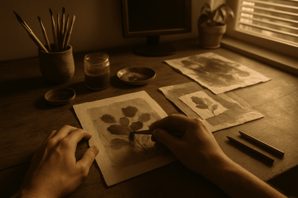
Get Clear on What “Mixed Media” Really Means
Mixed media isn’t about cramming your supply drawer onto one canvas. It means using two or more different materials in a single piece deliberately. It’s not about tricks or showing off. It’s about unlocking new ways to say what you mean.
Think acrylic paint layered with charcoal for moody contrast. Try ink linework with textured collage scraps for grit. Oil pastel over dried gouache? That’s softness over structure. Every combo brings out different qualities opacity, texture, precision, or chaos. They each add a layer not just to the surface, but to the story.
What makes mixed media powerful is that it offers choices. Not every idea fits inside the lines of a single medium. Combining techniques opens up texture, mood, and narrative you just can’t get from one tool alone. When it’s done right, the materials talk to each other and what they say feels more alive.
The Power of Layering
Layering can make or break a mixed media piece. When done right, it adds depth, texture, and narrative. But it’s easy to lose control and end up with a muddy mess. The key is intention, not just building up for the sake of it.
Start with structure. Know what your focal point is, and build layers that support not distract from it. Transparent or semi opaque mediums help early on. Think washes, light pencil marks, or soft pastel work. This phase sets tone and flow.
Dry layering adding material after the surface underneath has fully dried is ideal when you want crisp separation between elements. Great for making textures pop or keeping detail sharp. Wet layering working into a still wet surface blurs edges and blends tone. It’s emotive, fluid, but also riskier. Use it when you want mood over control.
Common mistakes? Overworking is at the top. The more you layer without pausing, the more likely you are to flatten contrast and kill vibrancy. Another: not letting things dry properly between layers, which leads to sticky patches, accidental smears, and frustrating paper tears.
The best approach: build slow. Observe after each layer. Is it adding or cluttering? Course correct if needed. Layering’s not just a technique it’s a conversation between materials. Listen close.
Choosing Mediums That Play Well Together
When working with mixed media, combining the right materials is as important as your creative vision. The interaction between mediums can make or break your final piece so choosing wisely sets the foundation for success.
Go To Medium Combinations
Some materials naturally complement each other, layering well and preserving both color and texture. Here are a few reliable pairings that tend to work across various surfaces:
Acrylic and charcoal: Acrylic provides a fast drying, colorful base to build on, while charcoal adds expressive, smudgeable line work.
Ink and collage: Ink outlines or brush work gives definition to layered paper, fabric, or found textures.
Oil pastel over gouache: Gouache serves as a matte base, while oil pastels add rich, buttery highlights or accents.
These combinations are especially effective on mixed media paper, illustration board, or primed wood panels.
What to Avoid
While combining mediums encourages experimentation, there are key technical pitfalls to watch out for:
Solvent incompatibility: Don’t mix oil based and water based materials without preparing your surface properly. For example, applying watercolor over oil pastel can lead to cracking or rejection.
Smudging: Soft pastels, graphite, and charcoal can easily smear if layered incorrectly. Always fix or seal as you go if needed.
Overworking: Avoid applying too many wet layers in succession. This risks breaking down your surface or creating muddy color areas.
Surface Preparation Matters
Your surface should match the demands of your chosen media. Before diving in:
Prime your surface if using heavier or wet on wet techniques (gesso is a reliable choice).
Use mixed media specific paper when combining wet and dry, as it can handle moisture and abrasion better than standard sketch paper.
Test layering on a small section or scrap sheet before committing across your full piece.
Tips for Long Term Preservation
A piece that looks great today can degrade over time if not sealed or protected correctly. Consider the following:
Spray fixatives work well for dry materials like charcoal, pastel, and pencil to prevent smudging.
Clear acrylic varnish helps seal acrylic or ink layers but may cloud delicate surfaces if not applied carefully.
Leave raw when desired: Sometimes letting materials age naturally (like torn paper edges) is part of the aesthetic just understand the risks.
Mixed media thrives on balance: control meets spontaneity, and technical awareness meets freeform creation. By ensuring your materials support each other, you create a stable canvas for creativity to unfold.
Texture and Contrast for Visual Depth
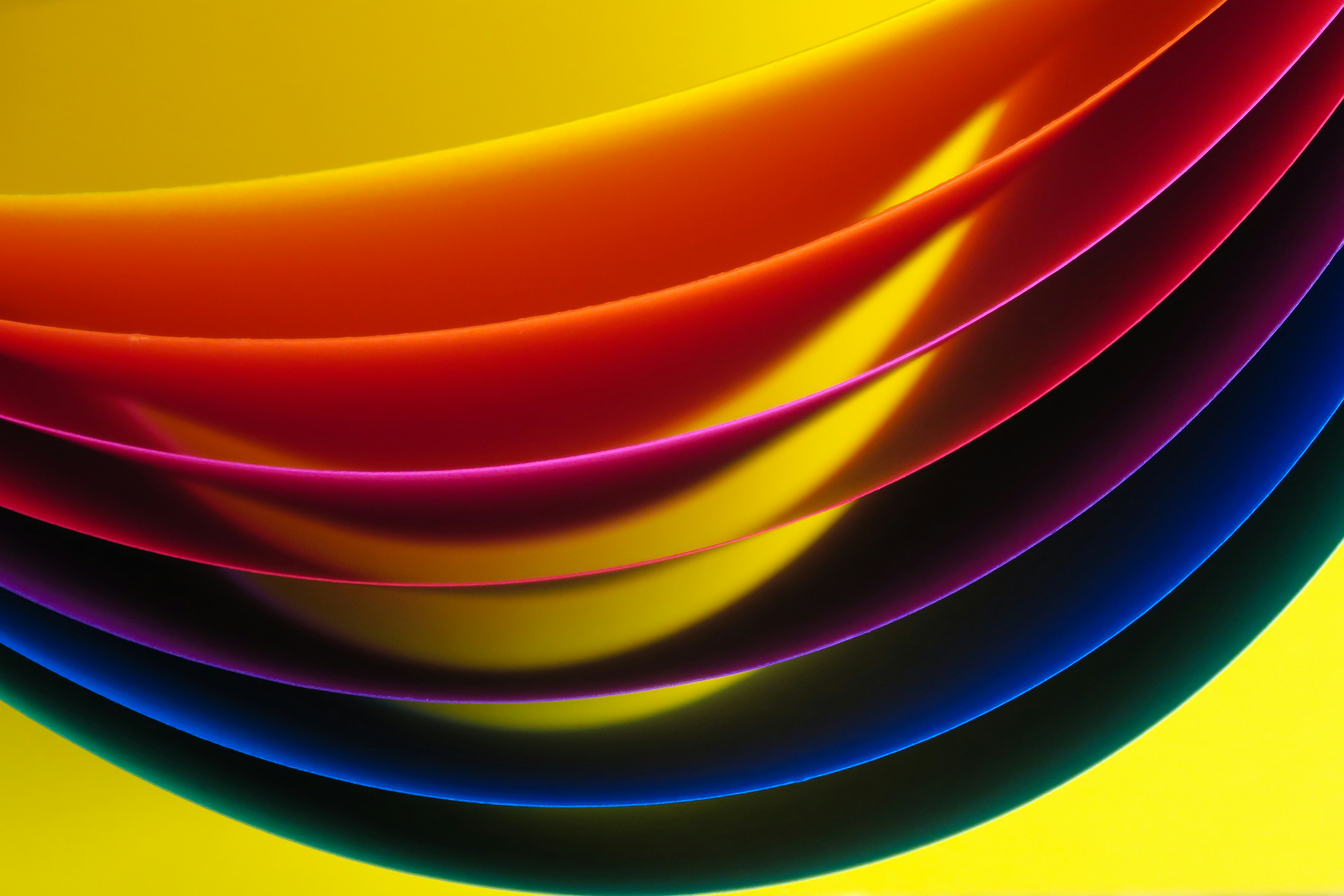
Texture is one of the quiet power moves in mixed media work. There’s tactile texture what you can actually feel when you run your fingers over a surface and then there’s visual texture, where illusion does the heavy lifting. The best pieces often use both, letting each amplify the other. Think cracked modeling paste next to featherlight ink washes your eyes take it all in before your fingers even get close.
Contrast is what keeps the eye engaged. Matte versus gloss, rough next to smooth, dense texture interrupted by calm empty space these juxtapositions are how you lead the viewer through a piece without shouting. It’s not just for drama. It’s structure.
Want to turn up the visual intensity? Bring in elements that spark curiosity: torn collage elements, rusted metal fragments, scraps of textile, or reflective metallics. These aren’t gimmicks. When used with intention, they lift the work into something layered and memorable. The trick is to make sure every added item serves the piece not just your impulse to glue stuff down.
Blending Techniques for Unity
Mixed media can slip into chaos fast if you’re not intentional. The trick is getting your materials to talk to each other. That starts with a plan or at least a throughline. Ask yourself: what’s the dominant visual language here? Is it brushy and bold? Tight and technical? Choose your supporting materials to echo that tone, not compete with it.
Some strokes deserve to stand out like a sharp charcoal line that cuts through layers or scratchy pen marks that energize a smooth acrylic wash. Don’t hide those. But if you’ve added a bold ink element and the eye gets stuck there, tone it back. Blend it in. Unity doesn’t mean sameness, but it does mean letting each piece of the image serve the overall feel.
Then there’s color a major glue. Use a limited palette or repeat certain hues across media types to build natural harmony. Try using a single tone across watercolor, oil pastel, and collage paper. That tiny echo makes everything play nice. Contrast is still fair game, but anchor it with common color cues.
The best mixed media doesn’t look like a collection of techniques. It looks like a single visual idea executed with range.
Mixed Media in Realism
Realism gets more complex and more interesting when you mix materials. Graphite has a crisp sharpness, while watercolor has blur and flow. Combine them, and suddenly you’re not just drawing a face, you’re suggesting skin texture, humidity, softness, age. The interplay between mediums acts like visual shorthand, letting you convey more than any single tool could on its own.
But here’s the thing: if you’re chasing realism, you can’t let the materials fight each other. Light and shadow become your bridge. No matter what you’re using ink, acrylic, pastel consistent lighting cues hold the whole piece together. Use darker fabrics or soft graphite rendering to anchor shadows; let highlights gleam with maybe a bit of white gel or drybrush acrylic. Your materials can change, but your light logic can’t break.
Mixed media in realism isn’t just about texture it’s about cohesion. Align your materials under one light source, play to their natural strengths, and you can create realism that carries depth and grit.
For deeper insight: Understanding Light and Shadow in Realistic Portraits
The Creative Payoff
Mixed media doesn’t just add flair it opens the door to work that feels personal, unpredictable, and alive. When you stop thinking in silos (paint here, ink there, collage only on Tuesdays), you start tapping into the real potential: expressive, layered art with a distinct voice. No two pieces come out the same because the process itself invites originality.
Ditching the rules of a single discipline gives you room to breathe. There’s no script telling you that pastels can’t touch watercolor, or that thread and spray paint don’t belong together. You figure out what makes sense for your piece, not for a textbook. That kind of freedom builds work that feels less like a copy and more like an imprint.
And yes it takes trial and error. The only real advice here: experiment. Mix something. Break something. Pay attention. What turns to sludge? What becomes gold? Test, observe, adapt, repeat. That’s how you grow past safe and into something stronger. Something that’s unmistakably yours.
 Bernardon Holmanate has opinions about art techniques and methods. Informed ones, backed by real experience — but opinions nonetheless, and they doesn't try to disguise them as neutral observation. They thinks a lot of what gets written about Art Techniques and Methods, Trends in Contemporary Art, Exhibition Announcements and Reviews is either too cautious to be useful or too confident to be credible, and they's work tends to sit deliberately in the space between those two failure modes.
Reading Bernardon's pieces, you get the sense of someone who has thought about this stuff seriously and arrived at actual conclusions — not just collected a range of perspectives and declined to pick one. That can be uncomfortable when they lands on something you disagree with. It's also why the writing is worth engaging with. Bernardon isn't interested in telling people what they want to hear. They is interested in telling them what they actually thinks, with enough reasoning behind it that you can push back if you want to. That kind of intellectual honesty is rarer than it should be.
What Bernardon is best at is the moment when a familiar topic reveals something unexpected — when the conventional wisdom turns out to be slightly off, or when a small shift in framing changes everything. They finds those moments consistently, which is why they's work tends to generate real discussion rather than just passive agreement.
Bernardon Holmanate has opinions about art techniques and methods. Informed ones, backed by real experience — but opinions nonetheless, and they doesn't try to disguise them as neutral observation. They thinks a lot of what gets written about Art Techniques and Methods, Trends in Contemporary Art, Exhibition Announcements and Reviews is either too cautious to be useful or too confident to be credible, and they's work tends to sit deliberately in the space between those two failure modes.
Reading Bernardon's pieces, you get the sense of someone who has thought about this stuff seriously and arrived at actual conclusions — not just collected a range of perspectives and declined to pick one. That can be uncomfortable when they lands on something you disagree with. It's also why the writing is worth engaging with. Bernardon isn't interested in telling people what they want to hear. They is interested in telling them what they actually thinks, with enough reasoning behind it that you can push back if you want to. That kind of intellectual honesty is rarer than it should be.
What Bernardon is best at is the moment when a familiar topic reveals something unexpected — when the conventional wisdom turns out to be slightly off, or when a small shift in framing changes everything. They finds those moments consistently, which is why they's work tends to generate real discussion rather than just passive agreement.