Why Color Still Drives the Conversation
Color isn’t just decoration it’s a visual language. In contemporary painting, color remains central to expression because it’s felt before it’s understood. You don’t need a background in art to feel the chill of a pale blue haze or the tension in a clash of saturated reds and greens. Artists today still lean on classical color theory, even when breaking its rules. Because at its core, color directs the emotional tone, sets atmosphere, and defines experience.
Palette choices shape how a piece hits you. A warm, earthy scheme creates intimacy; a cool, high contrast one builds detachment or scale. Subtle shifts in hue or value can set the mood before the subject even registers. That’s power and good artists know how to use it.
Despite a wave of experimentation and digital influence, the bones of traditional theory still matter: hue, saturation, value, and the relationships between complementary or analogous colors still guide composition. They don’t box artists in they give structure when intent matters more than impulse.
Key Principles Artists Still Rely On
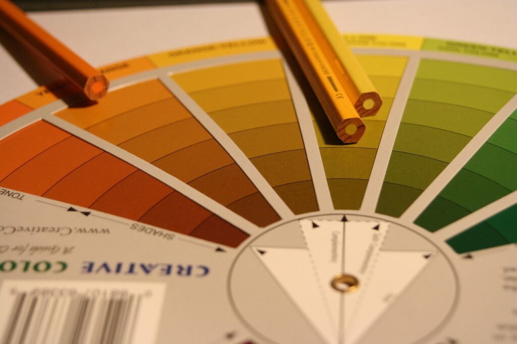
Let’s start with the basics. Hue is the actual color red, green, blue. Saturation is how intense or muted that color appears. Value is the lightness or darkness. Take a deep red, boost its saturation, and you’ve got something bold and loud. Drop the value, and suddenly it’s moody and dramatic. Artists lean on these three qualities because they shape emotional tone without needing a single figure or face in the frame.
Now let’s talk color schemes. Complementary colors are on opposite sides of the color wheel think blue and orange, purple and yellow. They create punchy, visually charged combos. Analogous schemes, on the other hand, are neighbors: blue, blue green, green. These flow smoothly, often used in calming or atmospheric work. The choice depends on the message. Is it tension you want? Use contrast. Harmony? Stay close on the wheel.
Modern painting also leans hard into warm vs. cool tones. Warm colors (reds, oranges) tend to feel active, even aggressive. Cool colors (blues, greens) are more passive, introspective. But today’s artists flip those associations too using icy blues for violence or hot yellows for serenity. There’s freedom in the chaos, but the structure is still there. Understand it, and you can bend it.
Breaking the Rules: Experimental Approaches
Traditional color harmony complementary pairings, balanced warmth and coolness, smooth gradations was built for a certain kind of beauty. Many contemporary painters aren’t chasing that. They’re deliberately tearing into it, replacing harmony with dissonance to keep viewers alert, unsettled, engaged.
The clashing palette is a tool. Think acidic reds smashed into sickly greens. Or pastels aggressively layered with harsh neons. These combos don’t ask to be liked; they push the viewer to react. In some works, the tension says, “Everything’s not fine.” In others, it becomes an aesthetic of chaos that mirrors the complexity of the artist’s subject grief, protest, digital burnout, or just personal messiness.
For many artists, color is personal language. That means the rules get rewritten depending on the story they’re telling. Someone processing trauma might lean into muddy, clotted tones to convey emotional fog. Another might stick a shock of turquoise into a sea of grey for a jolt of hope or defiance. These aren’t random choices; they’re coded. That’s why the same colors don’t mean the same thing between painters, or even between pieces.
This isn’t about rejecting knowledge of color theory it’s about bending it to say what needs to be said. Harmony gets shattered, but something new emerges: honesty.
The Digital Shift
For contemporary painters, screens have added a new layer to color theory. What looks rich and layered in person can lose its punch once compressed into a thumbnail or filtered through a phone screen. Digital platforms like Instagram and Behance reward high contrast, saturated images painters feel the pressure to adapt, even if it means lifting colors beyond what they’d choose for an in person viewing.
The RGB model, dominant in screens, behaves differently than the pigment based CMYK or traditional oil and acrylic blends. Blues are often more electric, greens can feel flattened, and black shadows may crush subtle tone gradations. This gap between physical media and digital display makes some artists rethink their palette entirely, opting for colors that will scan well in pixels without harming the live composition.
On top of that, creators now face the challenge of faithful digital reproduction. Lighting during documentation, editing software choices, and the quirks of different screens all influence how a viewer perceives a painting. Some artists embrace the distortion, tweaking their photo edits for mood or intensity. Others double down on fidelity, using calibrated equipment and even customizing web pages to maintain color integrity.
The line between painting for life and painting for the feed is blurry. But understanding how digital tools skews perception is quickly becoming as crucial as knowing what colors go on your palette.
Real World Inspiration from Today’s Artists
In 2024, color palettes are leaning into contrast both in tone and meaning. We’re seeing a strong surge in split complementary combinations, moody neons balanced with muted neutrals, and a revived interest in deep, earthy tones. Painters are intentionally leaning into color as a message: bold doesn’t always mean bright, and quiet palettes can hit just as hard.
One piece that made waves late last year is “Interior Dissonance” by Cleo Zhang, which pairs desaturated teal with dirty ochres and a violent flash of magenta. It circulated fast online, not because of a big social push, but because the unusual palette sparked instinctive responses half nostalgia, half disruption. Another notable study in color comes from Marcus Renn, whose work “Still Heat” uses shades of oxidized red orange layered over charcoal greys to evoke urban decay and resilience. Small exhibitions picked it up first, but it found serious traction once digital reprints started trending on design microblogs color as narrative, spreading fast.
While trends come and go, it’s clear this is a moment for intentional contrasts and emotional precision. Artists are using color to push viewers out of passivity.
Want more examples? Browse the inspiring painting gallery to see how contemporary painters are using color to tell stories, build tension, and reset expectations.
Pushing Your Own Palette
Mastering color isn’t just about knowing theory it’s about constant practice, sharp observation, and personal exploration. Whether you’re just beginning or refining the voice in your work, building a more intuitive and intentional color palette is key to growth as an artist.
Build a Daily Color Practice
Color confidence comes through repetition. Use small, focused exercises to develop a more instinctive palette. These strategies help train the eye and the hand:
Swatch Studies: Isolate specific hues and blend variations to better understand undertones and opacity. Try matching the colors in your favorite works or from real life.
Isolation Exercises: Focus on just two or three colors at a time. Limit your options to push creativity within constraints.
Color Journaling: Track palette choices over time. Make notes about what worked, what didn’t, and how shifts in tone impact mood.
Observe and Analyze
You can improve your palette by analyzing others. Study how artists use bold or subtle choices, emotional tones, and unconventional pairings. Each observation builds your visual vocabulary.
Dissect the palettes of your favorite contemporary works
Pay attention to color choices in media, nature, and design
Ask: what emotion does this color convey in this context?
Start exploring real world examples in this inspiring painting gallery. Look closely at how color sets atmosphere, builds narrative, or demands attention.
Experiment to Discover Your Voice
There are no shortcuts to developing your signature use of color. Allow yourself the space to test, iterate, and even fail it’s the best way to grow.
Try unexpected combinations
Work with a limited palette one week, then expand the next
Reflect on how each change impacts the energy of your work
Refining color is an ongoing process but with conscious effort, every piece becomes another step toward mastery.
Looking Forward
Color isn’t just visual anymore it’s political, emotional, and deeply reactive to the world around us. Social movements, environmental urgency, and shifting identity narratives are all playing out through palette choices in today’s painting. Earth tones are having a resurgence not as a trend, but as a quiet protest. Artists are leaning into burnt siennas, deep greens, and muted neutrals to reflect anxiety over climate and a collective search for grounding. In contrast, post pandemic palettes filled with bright neons and unexpected combinations show a craving for optimism or at least escape.
At the same time, materials are undergoing a transformation. Pigment innovation is moving beyond colorfastness and into sustainability. Plant based dyes, reclaimed oxides, and biodegradable mediums are replacing heavy metals and synthetic blends. Forward thinking artists are already making this part of their practice, not as a gimmick, but as a sincere extension of their values.
The takeaway? Color remains one of the most expressive tools a painter has. But in 2024 and beyond, it’s not just about what looks good. It’s about what resonates, resists, and reclaims.